
Are you working on a new website or thinking of revising your existing one? Make the time to take a good hard look at your About us page and show it some love.
You might wonder why I’m focusing in on a page that isn’t product-centric and unlikely to directly convert for you. Bear with me, there is method in my apparent madness.
When creating a website, most people focus their energy on their Home page. Does it look great? Is it optimised for SEO? Next they focus on the product or service pages. Is the messaging clear? Is their USP (unique selling point) obvious enough? Then they start to work on the pricing because once prospects are interested in the product they want to know how much it’s going to cost them. All of that is sensible, I completely get it.
Yet the About Us page is usually the second most viewed page on a B2B website. Let’s take a closer look.

Want to knock out your competitors?
Why your About Us page is important
For many of us, the About Us page content is bit of an afterthought; one of those website pages you know you’re meant to have but don’t have to devote much time to. But that’s a mistake. As previously mentioned, it’s one of the highest-ranking pages on a website.
Not only that, but since it isn’t a landing page, it’s a page that prospects are deliberately choosing to navigate towards, which is why most sites have it as a top menu heading. So if prospects are searching with intent, what are they hoping to find?
There tend to be 2 main schools of thought here:
- What potential customer can expect and why to choose this company, i.e. it’s about the customer
- A company’s own origin story and landmark moments, i.e. it’s about you
Let’s look at some examples of how that looks in practice.
It’s all about the customer
The customer-focused approach puts the company purpose front and centre and often zooms in a big and bold mission statement. One of the best examples firmly opting for this approach is Salesforce.
Salesforce
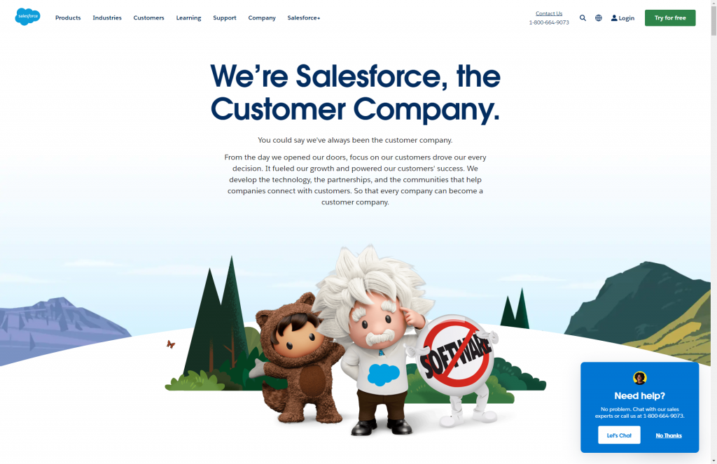
Their page reinforces a number of brand elements that Salesforce is known for, including branded iconography, meaning that their images work just as hard as their text. It’s very confident and instantly recognisable as theirs, even if you took away the text altogether.
Here’s a more traditional example, Google’s above-the-fold offering:
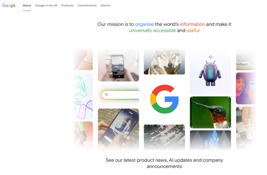
You will notice that they have opted to keep their mission statement quite low key with a smaller than typical sized H1, shown in their branded colours. The main focus is a montage of images intended to showcase their product offering.
Similarly, their CTA (call to action), which appears directly below the fold, is “Learn more” and takes you to a regionally appropriate page showing how Google impacts your area.
There’s no information here about the founders or employees, it’s all about Google’s products and an emphasis on how they are helping their customers.
There is actually a page about Page and Brin but I had to Goole search to find it! If you’re interested, this is the Google origin page.
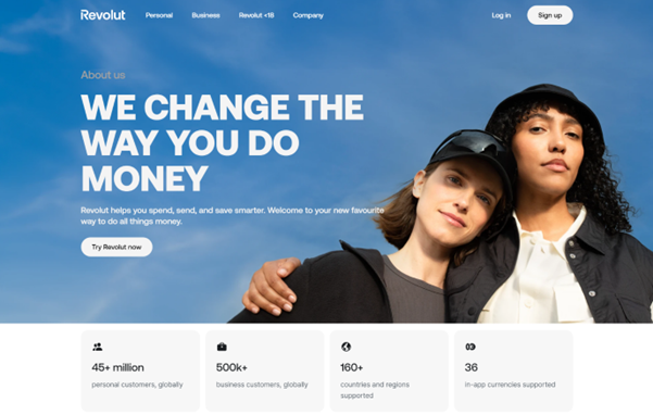
Revolut
Another common trope of this style of About page is the logo or numbers list. The purpose of displaying this kind of list is twofold. Firstly, it builds trust by showing prospects that you already have lots of customers. Secondly, in the case of logos, it’s a safe bet that the customers are happy with you if they let you host their logo, reinforcing that trust. If the customers are household names or important in your sector, better yet.
In the case of Fintech company, Revolut, we can see that they are using it to show their reach and credibility across the globe.
It’s all about your business
Making your own business the focus of your About Us page arguably provides more scope for innovation as brands with strong personalities are free to let them shine. They tend to operate in a slightly different way to the customer-focused approach, emphasising their company culture and ethos and creating a desire to belong. They often showcase colourful and original images, rather than stock photos.
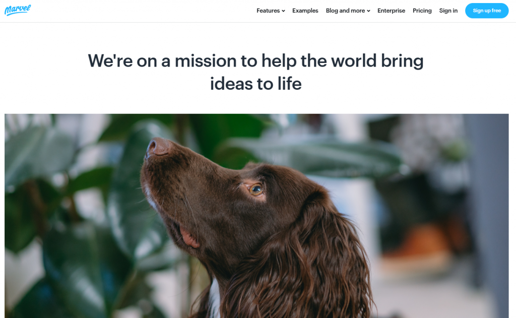
Marvel
Look at SaaS company Marvel’s example of this approach. Nowhere on their About Us page is there anything that tells you what their product actually is. The focus is firmly on what they want their company to be about and the kind of people that work there. Their bold choice of a dog as the headline image is either intriguing, weird or shamelessly tapping into the pet-loving market, depending on your viewpoint.
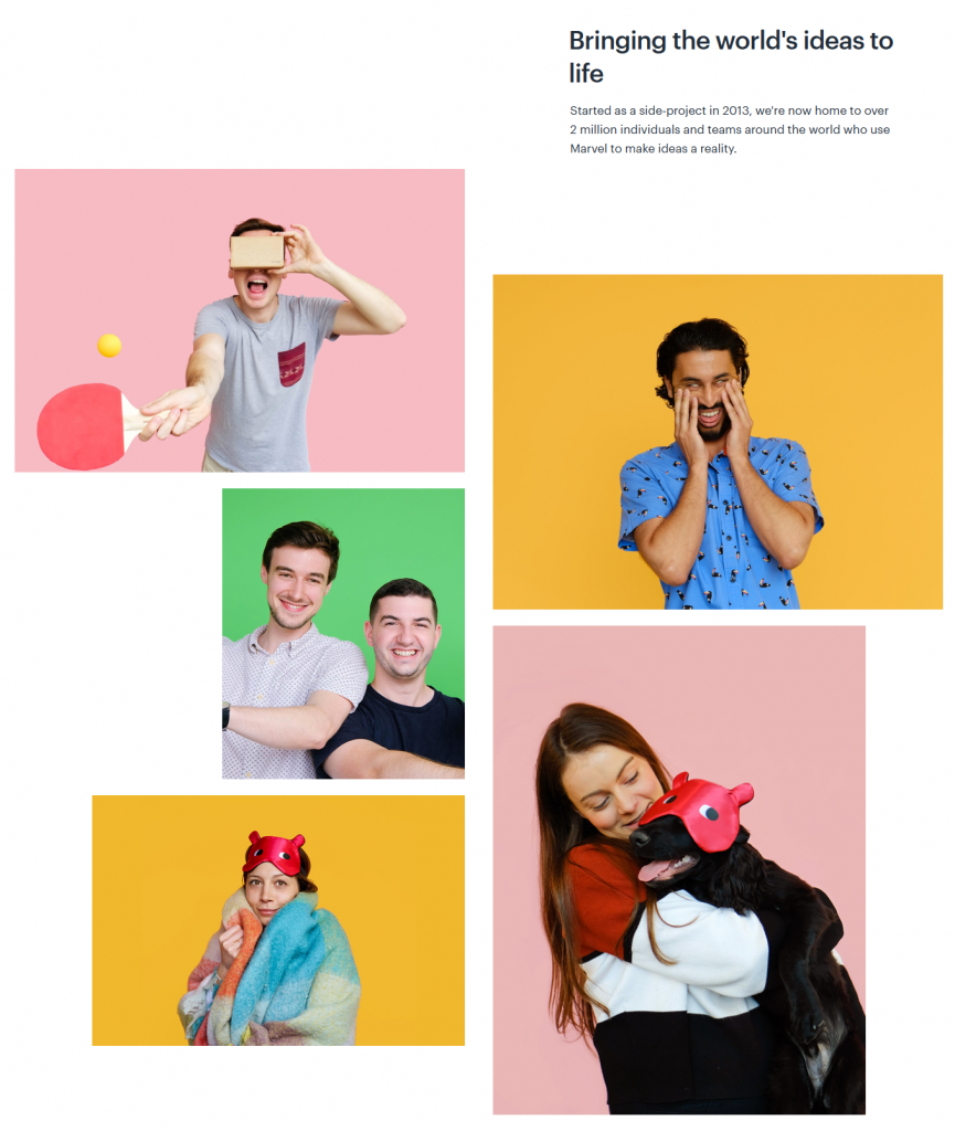
There are still regular tropes for this approach. Timelines often feature, showing key moments, such as award wins, office moves and landmark customer numbers. Company values are often featured. Those things tend to be further down the page, though, the key takeaway tends to be authenticity.
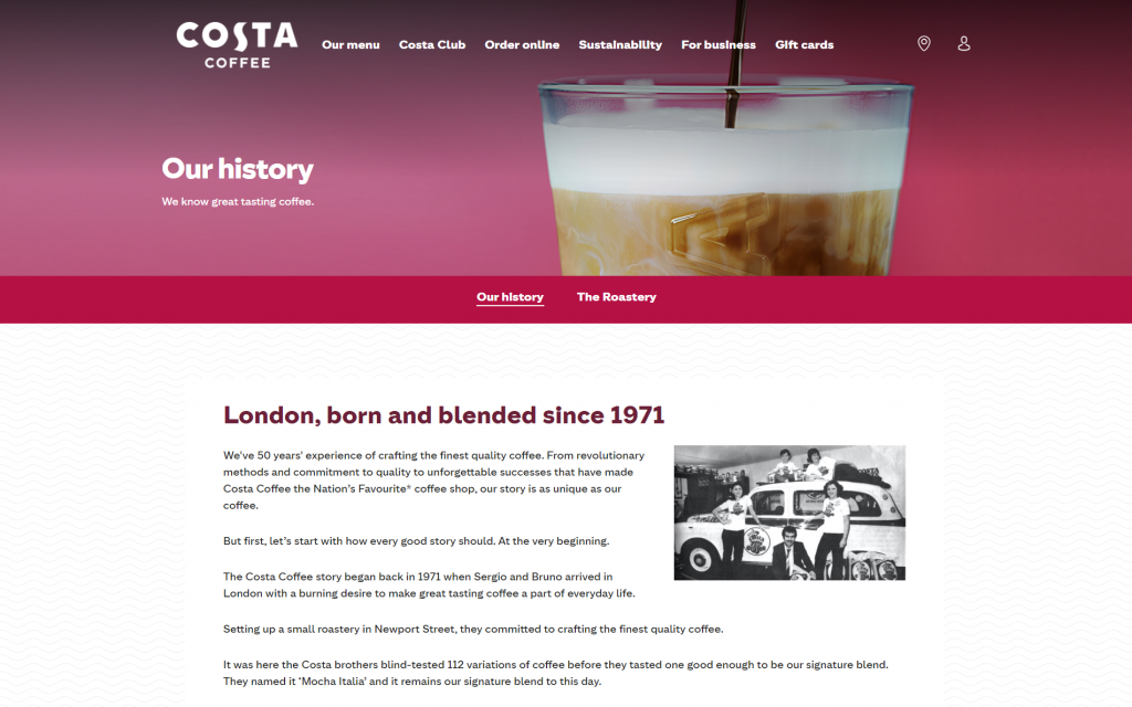
Costa Coffee
Costa Coffee goes all in on its history, showcasing original black and white photos of its early days in the 1970’s to emphasise the company’s longevity and expertise. They also have a secondary page, ‘The Roastery,’ that brings you up to date with more recent times and shifts to colour photography.

Want to add a dash of ‘je ne sais quoi’ to your content?
The 3rd way
GoSquared
I cheated earlier because I only mentioned 2 main approaches and I’m now introducing a third but hey, view it as a bonus option. I think of this as the ‘Dating profile approach’ because that’s really the focus of this option: are we a match?
Borrowing elements from both of the types we’ve already looked at, this aims to show both the company personality and evidence of trustworthiness. For example, let’s take a look at GoSquared.
As you can see, they’re jumping right in there with a bold H1. Not only do they build credibility by displaying an impressive logo insert but confirm their trustworthiness with their start-up year. 2006 for a SaaS company is ancient history. It was only the year after the founding of YouTube and the year before the launch of the first generation of iPhones.
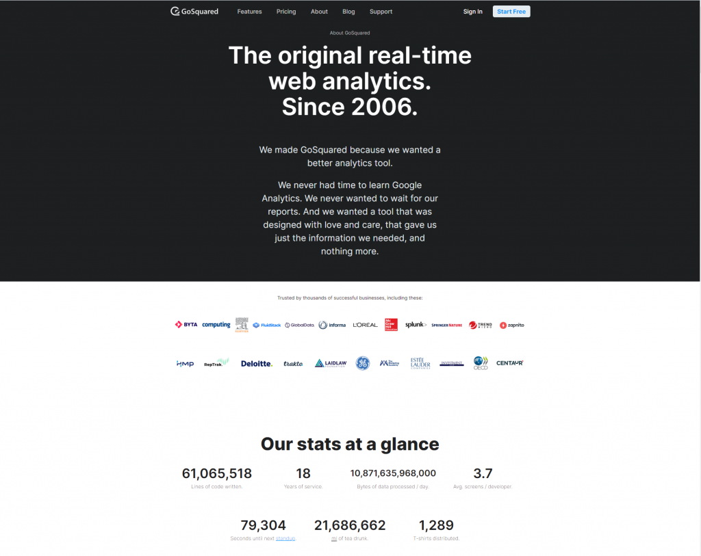
At the same time, they are telling us quite a bit about themselves as a company by the tone of their copy. It’s compelling. It has attitude. They see themselves as disrupters and, more importantly, they make you identify with them.
Who, what and why
Earlier on I asked what prospects are looking for when they visit About Us pages. In the B2B world, my hunch is that they are usually looking for a match. Just as with romantic relationships, when businesses are intending to build a long-term relationship with a business partner, they have a shopping list in mind. Here are some things they might be looking for on your About page:
- Longevity: are you still going to be around a few years down the line? Where it’s relevant, are you a good long term commitment?
- Trustworthiness: do you have customers and are those customers happy? Have you won awards or professional accreditations?
- Cultural fit: do you share my outlook and aspirations and those of my businesss?
Essentially, they will be looking for answers to who you are, what you offer and why you should be their partner of choice.
‘About’ pages are a great way to showcase answers to those questions, so don’t leave them languishing, make the most of the opportunity they present and really make them pop.
Are you convinced but need some help doing it? Contact me and I’ll talk you through it.
Leave a Reply